Portfolio Details
Designed end-to-end digital insurance solutions across mobile, web, and dashboards, simplifying complex workflows into seamless user experiences.
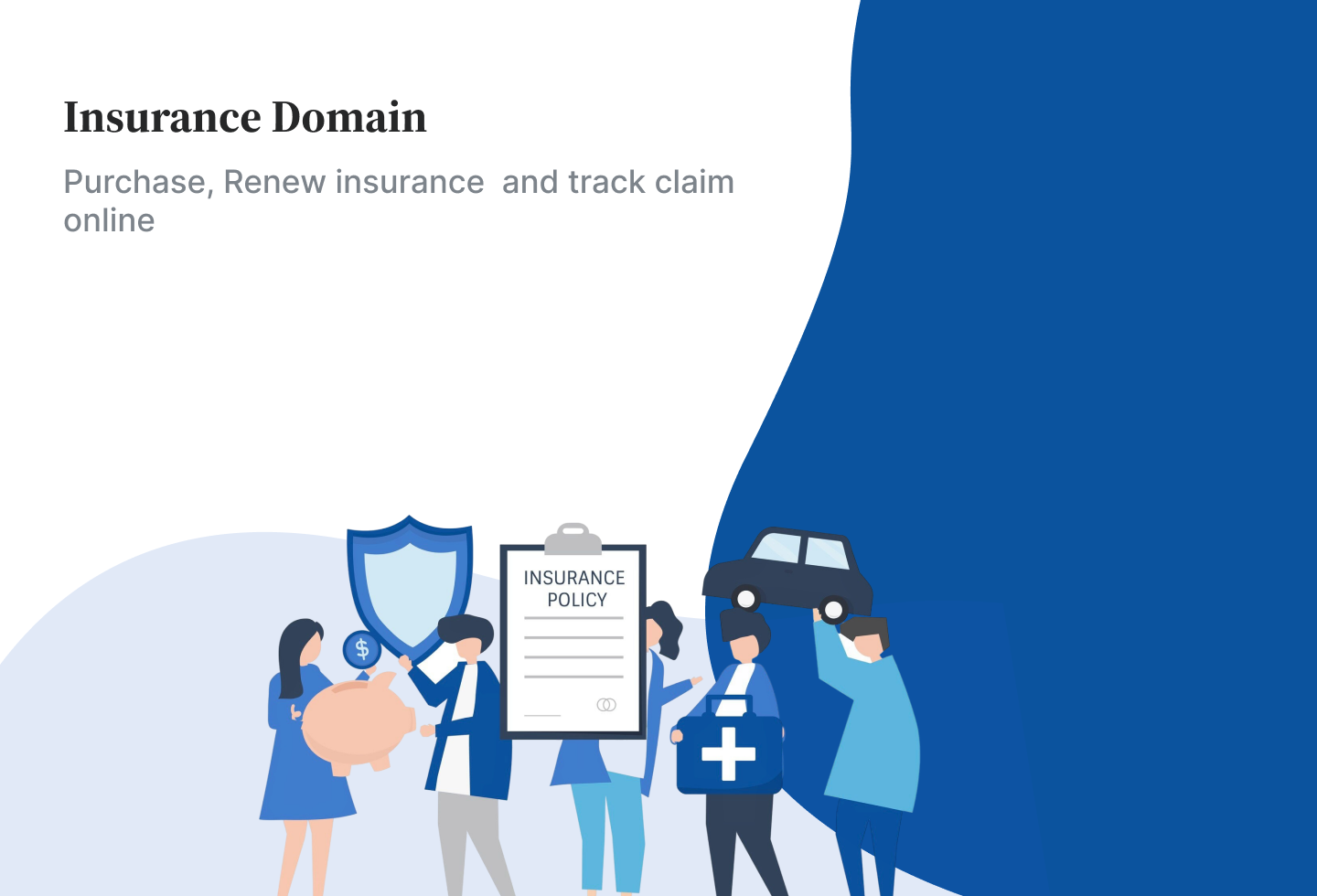
Insurance Domain
Mobile App
1. Simplified onboarding and KYC by introducing step-by-step screens, auto-fill, and progress indicators — reducing drop-offs and boosting completion rates.
2. Redesigned navigation with bottom tabs (mobile) and structured top menus (web) — enabling faster task completion and higher engagement.
3. Optimized policy information using collapsible sections, description with icons and comparison tables — improving readability and helping users make quicker decisions.
4. Streamlined claim submission and payments through guided steps, real-time checklists, and multiple payment options — reducing abandonment and increasing successful completions.
5. Enhanced transparency and modernized UI with real-time status tracking, verification tags, and responsive design — building user trust and brand credibility.


Website and Web Applications
1. Simplified complex workflows by creating guided step-by-step modules with progress indicators — reducing user errors and improving task completion rates.
2. Improved information hierarchy and navigation through role-based dashboards, quick-access widgets, and global search — boosting user efficiency.
3. Enhanced data management with filters, sorting, pagination, exports and import, bulk upload and status tags — making large records easier to scan and manage.
4. Increased transparency and communication by adding real-time tracking, notifications, and history logs — building trust and accountability.
5. Revamped visual design and branding with a unified design system, modern UI, and responsive layouts — ensuring consistency and stronger brand identity.
My Learnings
1. Designing for Complex Workflows
I learned how to simplify multi-step processes (like KYC, claims, task assignments, and patient bookings) into clear, guided flows that reduce errors and improve completion rates.
2. User-Centered Navigation & Information Architecture
I realized the importance of intuitive navigation—whether through bottom tabs in mobile apps, comparison tables in websites, or role-based dashboards in portals—to help users quickly find what they need.
3. Data Visualization & Readability
I learned to transform text-heavy or cluttered information (policy details, records, or reports) into structured layouts with filters, collapsible sections, tags, and visual cues for better scanning and decision-making.
4. Building Trust Through Transparency
I understood that users need constant feedback. Adding real-time status tracking, verification tags, and notifications significantly improves trust, whether in insurance, office tasks, or healthcare portals.
5. Scalable & Consistent Design System
I learned how crucial it is to maintain consistent branding, typography, and responsive layouts across products—ensuring usability while also strengthening the overall identity of the company’s digital ecosystem.